
The Effect of Font Characteristics on Large Format Display
Article Sidebar
Main Article Content
Abstract
Objective: To assess the legibility of a large set of existing large format display fonts.
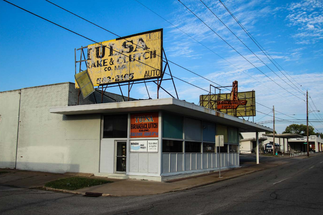
Background: The enormous selection of fonts allows for creative design; however, while there has been a lot of research on print and computer font legibility, only a limited number of large format display font studies have been conducted.
Method: Sixty-four subjects from 19-87 years of age viewed 64 displays using 33 fonts shown on a computer monitor. Viewing began at a very small size, which grew larger to simulate a driver or pedestrian approaching a sign. Subjects attempted to read the displays at the smallest possible size. Threshold legibility was determined for each font.
Results and Conclusions: Font selection can make a very big difference in the distance at which a display can be read; however, there are many fonts that have equivalent legibility. Case can sometimes, but not always, have a large impact on display legibility, with uppercase often performing significantly better than lowercase. The choice of serif versus sans-serif alone does not have an important effect on display legibility. Age impaired sign reading ability, but not until the participants were over sixty. Finally, fonts that share a family name (e.g., Times Bold versus Times New Roman) can have dramatically different legibility distances.
Application: The results of this research can immediately and directly aid letter manufacturers, display designers, and display owners, as they now know how far away a large number of fonts can be read, and the impact of choosing one font style over another.
Article Details
Section
References
Forbes, T. W., Moskowitz, K., & Morgan, G. (1950). A comparison of lower case and capital letters for highway signs. Proceedings, Highway Research Board, 30, 355-373.
Garvey, P. M. (2007). Urban wayfinding signs: Evaluating exceptions to FHWA's standard alphabets. Transportation Research Record: Journal of the Transportation Research Board, (2030), 10-14. National Academy Press, Washington, D.C.
Garvey, P. M., & Kuhn, B. T. (2011). Highway sign visibility. Chapter 11 In M. Kutz (Ed.), Handbook of Transportation Engineering (2nd Ed.), McGraw-Hill, New York, New York.
Garvey, P. M., Thompson-Kuhn, B., & Pietrucha, M. T. (1995). Sign visibility literature review. United States Sign Council (USSC) Research Project, Final Report.
Garvey, P. M., Pietrucha, M. T., & Meeker, D. (1997). Effects of font and capitalization on legibility of guide signs. Transportation Research Record: Journal of the Transportation Research Board, (1605), 73-79. National Academy Press, Washington, D.C.
Garvey, P. M., Zineddin, A. Z., & Pietrucha, M. T. (2001). Letter legibility for signs and other large format applications. Proceedings of the Human Factors and Ergonomics Society 45th Annual Meeting. 45(18), 1443-1447. Human Factors and Ergonomics Society, Santa Monica, CA. https://doi.org/10.1177/154193120104501828
Kuhn, B. T., Garvey, P. M., & Pietrucha, M. T. (1998). The impact of color on typical on-premise sign font visibility. In Transportation Research Board's 14th Biennial Symposium on Visibility, Washington, D.C.
Legge, G. E., & Bigelow, C.A. (2011). Does print size matter for reading? A review of findings from vision science and typography. Journal of Vision, 11(5):8, 1-22. https://doi.org/10.1167/11.5.8
Mace, D. M., Garvey, P. M., & Heckard, R. F. (1994). Relative visibility of increased legend size vs. brighter materials for traffic signs. Federal Highway Administration publication no. FHWA-RD-94-035, Washington, D.C.
Yager, D., Aquilante, K., & Plass, R. (1998). High and how luminance letters, acuity reserve, and font effects on reading speed. Vision Research, 38(17), 2527-2531. https://doi.org/10.1016/S0042-6989(98)00116-3
Zineddin, A. Z., Garvey, P. M., Carlson, R. A., & Pietrucha, M. T. (2003). Effects of practice on font legibility. In Proceedings of the Human Factors and Ergonomics Society's 47th Annual Meeting. 47(13), 1717 - 1720. Human Factors and Ergonomics Society, Santa Monica, CA. https://doi.org/10.1177/154193120304701326